Week 5: Title Screen And Buttons!

OK so we got 2 more weeks until our Beta-Deadline, uh i can feel it closing in!

I wanted to plan everything so that we don’t miss out on the stuff we need to add to our game, i got the tip from our SCRUM-Master, Lee. Lee is a third year student and works as a mentor to us, he has done some projects before us and been the “Producer”. He asked me about how i keep track on our progress besides the SCRUM-Document, I honestly didn’t! So he told me to look at all the things we needed to do before the beta deadline was due. So i did, and i wished that i would have done it earlier, we now have a long list of tasks. But this is good, now our members should be able to know how far we have come and what needs to be done!

To represent the 1940’s, I also used the art deco font here, we need to stay with the style we chose. I present to you our title screen (still under construction), and here you also see the name for our game. I thought the game title “Plans of Futura” would represent the game we want to create.
Our short back story would go something like this: The game takes place in the 40’s but in an alternate universe. A technically advanced company named “Futura Corp”, sits on some heavy plans for the future, you will work as a spy and try to retrieve these plans… as simple as that! So the game title would be pretty obvious, and I chose the name “Futura” so that you will get the hint that this involves the future.

AshTitleScreenFinal


So to merge the title screen with some future technology buttons I went with some animations for the button; button pressed and how it will react as you hover your mouse over the button.

button

For the light animation i had the image ready in my head; the color choice that first strikes my mind is the baby blue, to represent some kind of laser or diode. I tried to pulsate it from the top left corner to the lower right corner, but that did not look good at all. After that i tried to make it pulsate from the middle but i don’t know, i liked this option more. It gives us clean and swift kind of button, one that i feel more at ease with.


Newgame

This one is only an ordinary button, the easiest one to design, i used the layers in Photoshop and moved one layer a bit further up, then i added the two vertical lines and a darker bottom just to give the button some perspective.


This is my first time animating stuff, i had to go through a tutorial to make the light move like that, i went around and asked my classmates about it. And now i have become a bit wiser! And it turned out to be fun!

Now for next week ill have to take on a new task, depending on how far the others have come i may have to step in and help them completing other tasks!

Until then! Have a nice one!

Week 4: Small talking about HUD & GUI

This week I shall present to you the mission objective icon, and also a HUD (Head-up Display).

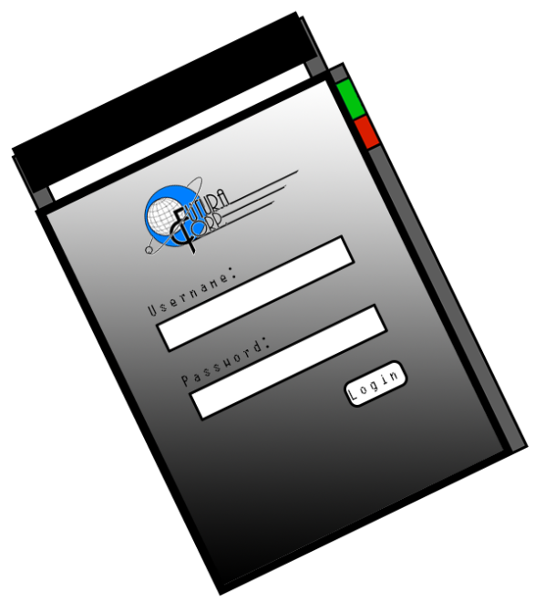
This is a PDA containing some of the Corporation plans, and blueprints, yes, in the 1940s this would be shown as a filing case/folder. First out I started drawing a beige file, then I started thinking about how to make it futuristic looking. Then I remembered the tablets of today’s technology… real life, but still… it did not exactly have what I was looking for. After looking at medical chart holders I remembered a design we got shown at a game jam we had with Ryu Shimizu (which he designed himself if I got it right). The inspiration I got from his design is the upper handle. And to give it some details I added a start screen with, of course, our games corporate logo! And to add some more, I placed a log in screen, with Username and Password (only for decorations, not interactible in-game).

Image

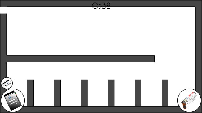
I apologize in advance for the empty background for this next picture, we were planning to have some kind of level by now but that did not happen, due to the lack of experience in level designing I guess.. but I may take that task upon myself and try to put up a level for our alpha version, if everything goes well and the programmers can help me with this, I can put up at least 2 rooms.

Image

Now emerging the HUD (the timer and circles with icons in them) with the map gave us this test game screen as a result. I guess you have noticed that the timer up there does not show properly due to the background color, I will need to do something about that, and the circles that’s positioned at the bottom corners may need some more adjustment, maybe add more details, or something that will represent our futuristic style.

But for now I am only testing the level build up, so no animations are available. No effects on the game screen will happen for the alpha version, we are a bit behind schedule so that will be of future concerns ( With this I mean that i am gonna push a bit to get it done faster!) . A few things we plan to add is:

– A red flashing screen when the guards are alerted.

– Of course animations for attacking and opening doors (Right now there is a picture of a player floating around the screen area).

– Sounds for shooting, steps etc..

Our deadline for the alpha is tomorrow, I don’t think that the HUD will be shown there, we only need to present our core mechanics, when we nail that down, we can start looking at artifacts to add.

Enough for now! i have to hold a small presentation tomorrow 😉

Week 3: Game designing project.

As written before we were assigned titles to our so called “professions”. Being part of the graphics group, I got elected Lead Artist. Under the duration of this project well have to present the work that we have done! For now I also carry the title of “producer”, keeping track on the project and planning according our deadlines ahead.

I created a logo to add a bit more identity to the company that the player will have to infiltrate, and one that would also support the title of our game: “Plans of Futura” (“Futura” goes for both the company and the future):

logo

I chose the Font because of its art deco style. Art deco is an architectural style that was prominent during the 20-40’s. It fits perfectly with our aesthetics.

An artifact of my choosing to present for this week would be a weapon, the “Gun”.

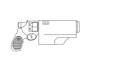
To design this artifact I had to follow our concept, converging the 1940s with future technology. So I used an attachment on a recognizable weapon, a revolver:

gun

I removed the barrel and the cock, and placed two fuses that represent the two loads (charges) of ammo, and an activation button instead of the cock. The pipe is replaced with a technological device that will convert the projectile and the result will be plasma pulses that work as damaging bursts.

To make it a bit more “futuristic”, I applied two red diodes lighting up the gun when it’s activated. And of course to show the manufacturer I placed the company logo visible on the new device. I skipped the shadowing of the gun so that it would fit our level of graphics (clean and not cluttered). The gun will be placed at the HUD, this is not how it will be displayed when the character carries it, but the red dots on the gun should be visible though. We haven’t tried it yet on the sprites but it should make the gun recognizable from a top down perspective.

We had to think a lot about the usage of a gun in our stealth game, so we had to consider a few outcomes or consequences to use this weapon. Even though the player thinks that this would be the easiest way to clear the game, using the gun can have some devastating results. As the gun only have two charges (two rounds of ammo), and the high noise making, this attracts guards that stands further away.

If the guards get alerted the process of reaching you goal will be a lot harder. We want this to trigger a kind of fear of using this weapon, and hopefully this won’t be a “shoot ém up” going out of hand and resulting in the player shooting his way through the game (That is also why I chose to only give the player two rounds to shoot with so that it would prevent the possibility to go on a killing spree). If this happens, our core feature will lose its value; the reason to sneak around would be meaningless.


The SCRUM-Document has been handed in, we have completed our backlog and are concentrating on the sprint planning and review. Most of the features are intact, we may take away some items that will be placed in the map, the one thing we had to insert was the deadlines for each task we had put there in the first place.

Monday we are going to sit down and look at the Game Design Document and try to finish it as soon as possible so that we can concentrate on drawing sprites and work on the game features. If I’m able to do that I would have more time to make things look better. That would result in more corrections

I will draw most of the items and menu modes. If the time allows, ill jump in and help drawing either the level design or character designs, it depends on what’s behind on our schedule.

We went on to lectures regarding, Game balancing, level design, design, prototyping and testing. Refreshing our past knowledge and reminding us about “fun” gameplay, we forgot about that and where only concerned about the mechanics of the game. I’ll have to remember to have an open mind about this project.

I am going to plan the first steps into the game to give some hints without any annoying “hint”-Popups. The first entry should tell us how to take out gars, collecting a key and using it. Otherwise the player won’t know that you can only use the key once, and then you will have to find a new one.

There is not a solution for how the player would know how to sneak other than to look at the controls before starting the game, but the chance for a player reading about the control usage is very slim, so we have to implement that into the “tutorial”-like start. So starting in a point where you are forced to learn, is a must.

Now failing our deadlines would result in scattering our teams and getting assigned new teams, but that would mean that we need to jump into different designs made by other groups and that would only be confusing. Now failing deadlines should not be an option! We need to work hard in the beginning so that we can relax later on and working on details without any time pressure.

The picture of the day:

Image

This gun will be used in our game, we argued alot about what we should change about it. so i just “fuses” to be used as ammo, it can only shoot 2 charges (rounds). You wont be seeing the gun in this detail as you play the game froma Top-down perspective, but it will be displayed in the HUD.