Attracting people; A second try

I wasnt that pleased of the last result i had regarding the banner, so i dug around and got a second chance in creating a new one.

I consulted Nicodemus (A guest lecturer in the Game design program) about my banner and he gave me some good pointers. My previous banner lacked a good construction, the main focus in the picture fell on the middle part of the picture where the “&” sign was located. And applying the characters to the banner was not a recommendation. So making a new banner completely different from the first would become my new goal.

And here is the results on this one:

NewBanner
The final banner

As for this one i also consulted Nils, and he would discuss the changes I made for this banner. Later on Oskar’s father came to visit him and he was an art teacher before he retired form educating, so i asked for his opinion on the use of colors, and Oskar also made some suggestions. After a lot of work i finally was satisfied with the result… almost.. The “&” sign is still stealing a bit of the light from the banner.


Now looking back at this and reflecting a lot I come to realize that i sometimes would have to make a lot of different set ups for content i want to work with, more alternatives gives us more positive outcomes. I will use this for my next task, and that is creating a logotype for our group.


You can visit Nils and Oskars blogs here:

Nils: http://wordpress.com/read/blog/id/58700763/

Oskar: http://wordpress.com/read/blog/id/12741548/


Attracting people with banners!

Last week i had a task to draw a banner that would be placed  at our game station, my lack in experience regarding the use of colors (as i have only worked with white an black) made this task too difficult to do, that is why i didn’t post anything last week, it wasn’t nearly done.

I will try to show you how i made this one and all of this wouldn’t have been done if not for the help i received from my friend Nils. He is a great artist with a unique style, and he helped me with arranging colors check out his blog here :  http://wordpress.com/read/blog/id/58700763/ .


So first of I made a lot of sketches by hand then i tried them on the computer. Nils made a sketch idea that i tried to follow, this one was meant to be for a drop down banner which i later on learned that we weren’t going to do them.

Backdrop
First layout for the drop down banner inspired by Nils

Then i started to create the new one, working from scratch and building it up step by step. And it turned out to be the wrong size, so i went and checked the sizes and started to adjust the picture.

Banner1
Trying out the colors recommended by Nils

For the final step i had to redo the structure beacuse it confused the reader, people read it :”Crash Flash”, when the title would be “Flash & Crash”. So i had to redo the structure… again….

Finally i was kind of satisfied with the final structure, even though i think that it could have been better, but i guess have a long way to go regarding the use of colors in my work. I have been reading a book regarding colors , shading and values. But it is still hard to know how to combine colors even though it is presented right before me. But on the bright sight I now have something to look forward to and a goal to strive for.

Banner
The final adjustment after many reconstructions.

Starting the Theme Park project.

We finally got a green light to start producing our game!


We had a bit of a struggle regarding the concept we had. The judges didn’t find it amusing enough as it is a kind of a puzzle game. The thing for the project is that we cannot use any console or computer controls (Ps3, keyboards etc.) So for this project the player (or to, we are aiming for a co-op puzzle game) will have to control to balls to complete a set of challenges, everything from getting passed moving platforms or pushing buttons to open gates.

The reason that we didn’t get a “green light” was due to the complicity to create an appealing puzzle, and for the input we are going to use two large trackballs, and that often would attract people who just wanted to spin them as fast as they could (like racing on a track), in other words the risk would be that the player jumping in to this game would feel disappointed  as they would expect a vicious race and not a slow paced puzzle.

So to make it entertaining we decided to put robots that would hover over the ball, (first it was a beach ball and a steel ball) the two different characters would carry different abilities, so the key is to work together.

The hard thing with this project would be the 3D designs, we have one artist that knows his way around, and another one is learning.. I on the other part can only design cubes and spheres…..

And my skills in using colors aren’t worth mentioning, and you will now see why:


Concept Art
Front page for the concept document. The two characters “Tesla” (The white one) and “Bucket” (The one lying down)

As you can see, the coloring are baaaaaaaaad. So ill have to learn more about how to do this.

And that’s all for me! Have a nice weekend!

A bit from the 2D 2 assignment. Quick post!


This course ended two weeks ago, i failed one of the assignments, that was creating a storyboard to present a moment that would take place in a game. The first one was an animation but it failed, so i thought of making a storyboard from a story i posted earlier (Emely http://wp.me/s3Yksj-emely ).

So i did a quick storyboard and i finally passed. But now there is a reflective assignment left to do. (I edited the text dialog’s a bit)


Storyboard: "Emely"
Storyboard: “Emely”

Thats all for me for today!

What happen to week 10?

I was supposed to post about the project result last week but i actually forgot about it. The only thing i wanted to do was to get some rest…

So last Thursday we sat up all night polishing the game, i put a to-do-list as, but the lead programmer said that we didn’t have the time to complete everything so we ended up trashing a lot of features. So the artist would sit down and finish all the art that we could use. I darkened the level and adjusted the contrasts of different objects.

At the final were we had to present the game to the class we heard that the game had a lot of bugs, missing a mission objective, in other words it was not completed at all. Weirdly enough people didn’t give us that much critique as we thought that we would get.

I handed in my post mortem but not the game, we didn’t have a functional prototype, the game was missing some dll-files. This was a bit frustrating, we was working with this project for ten weeks, only to see a barely playable game.

But now that its over we started to work on the second project, but this time with a new group assembled by us and not by the teachers. We are working on our “pitch”, if our game gets approved by the moderators, i will present our game idea here.

As for now take a look at what i have done (Still trying to learn how to get better at drawing).
This is a character that i used to draw in a comic used in a high school project (Gymnasium), i wanted to see how much i have evolved from back then. I know that i should have put a before and after picture but… i don’t have one to compare with (its all in my mind ):)


liemann
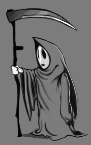
A reaper – Ahmad Ali