A picture analysis with the help of some “elements of art”
Evil within
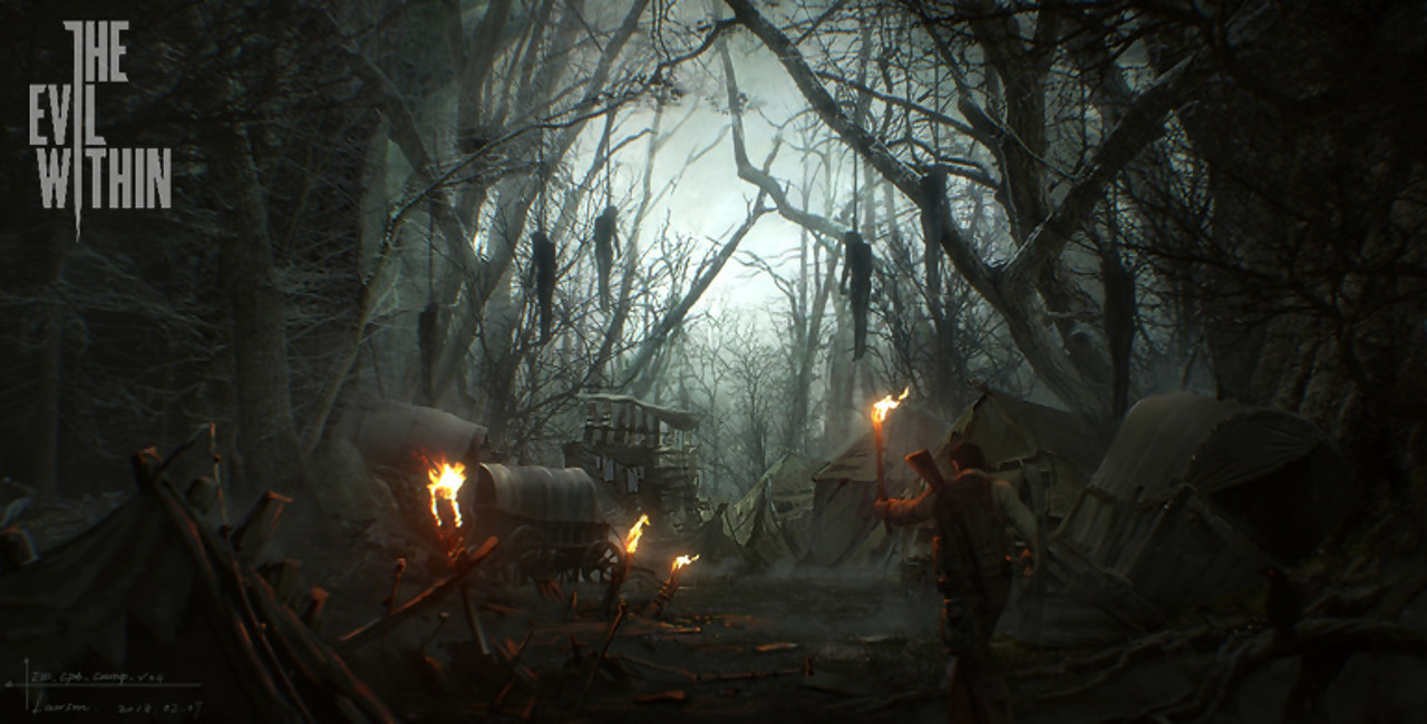
Line: Most of the lines are vertical by looking at the trees, this gives us a feeling of inferiority. For example if we have to look up towards something or someone we feel small, things that are above us tend to feel more powerful. This can be seen through pictures taken of a person from a down-top perspective. We can also see that the tree branches also stretch out diagonally, by portraying something diagonally we convey a feeling of a movement in direction, this is often done cinematically where pictures or objects are tilted a bit (A better example will be provided below). Combining both vertical and diagonal we get chaos, especially in this picture were we are supposed to feel the horror.
Shapes: The trees are pointy and sharp, instinctively we avoid these “shapes”, as sharp things reminds us of knifes or claws we tend to be cautious. The tents have round shapes and don’t intimidate us.
Space: As space is not usually used in modern pictures this one was pretty hard to point out, but I would say that the silhouettes here against the bright background would be the positive spaces. The hanging corpses give the main focus in the picture.
Values: Extreme contrasts, the brightness in the middle gradually getting darker reaching the edges of the picture, in the midst of the darkness you have some torches that give some warm colors but it is nothing compared to the cold white and blue colors that covers the rest of the picture.
Colors: The dark and cold colors here give us the feeling of discomfort and depression. Combining this with the rest of the features of the picture with the shapes and lines we feel both fear and sadness.
Texture: The fabrics of the tents, the wooden materials, the clothes of the living person, barely distinguishable grass on the ground.
As you now can see the thinking process of this analysis I will continue to analyze the remaining pictures but not as thoroughly as the previous one.
Far cry
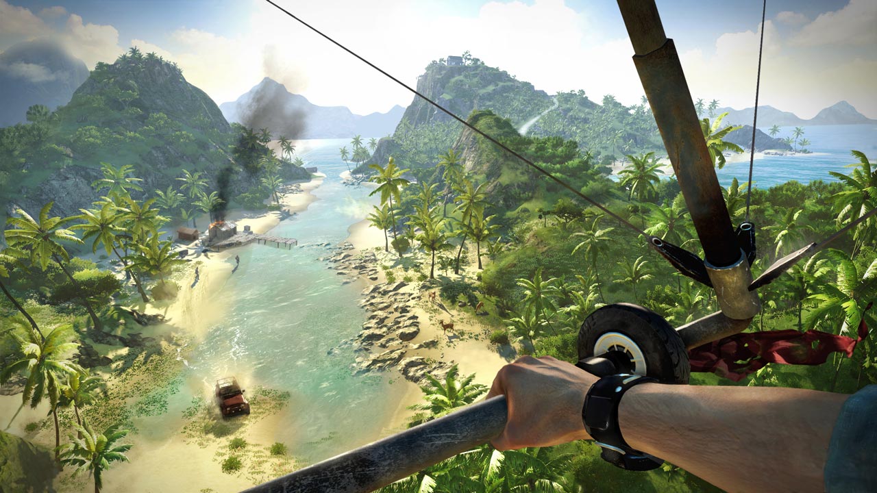
Lines: Here you have a horizontal line stretching in the background, this often brings a harmonic and relaxed feeling. The diagonal lines would be the metal of the glider, and even down at the beach you can see that the lines stretch out through the picture.
Shapes: natural shapes but also some man-made stuff (like the vehicle or the small cabin). So this doesn’t feel like it’s a dangerous area, the organic nature here are overwhelming.
Space: So here I would say that the negative space would be the glider metal and the hand.
Values: A high and colorful setting, a lot of bright colors.
Color: There is harmony in the colors, as the blue and green go together with the yellow beach, it delivers the warm environment that we soar above.
Texture: nature, metal, the rubber tire, the organic skin of the arm and the red cloth hanging on the side of the glider.
Middle earth Shadow of mordor
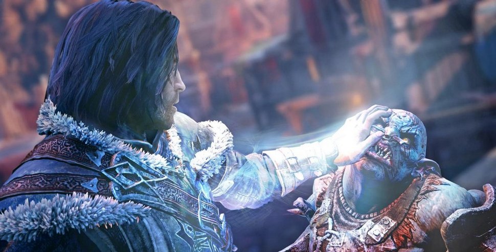
Lines: Diagonal, this shows the line of action in this picture by looking at his arm.
Shape: An organic enemy, man-made structures in the background and the armors. Taking a closer look at the enemy being strangled; pointy ears and sharp teethes.
Space: The picture is pretty much concentrated on the two characters here, so the background is blurry and most possibly not as important as these to two.
Values: This picture here is pretty bright, where the light seem to come out of his hand.
Color: Cold colors, blue and white. At the background we can see a hint of red, these two in a combination reminds us of cold early mornings.
Texture: Man-made metal and structures here, enemy organic skin. Texture of hair and fur. Bones and muscles. And the “condensation” coming out of the humans hand.
Watchdogs
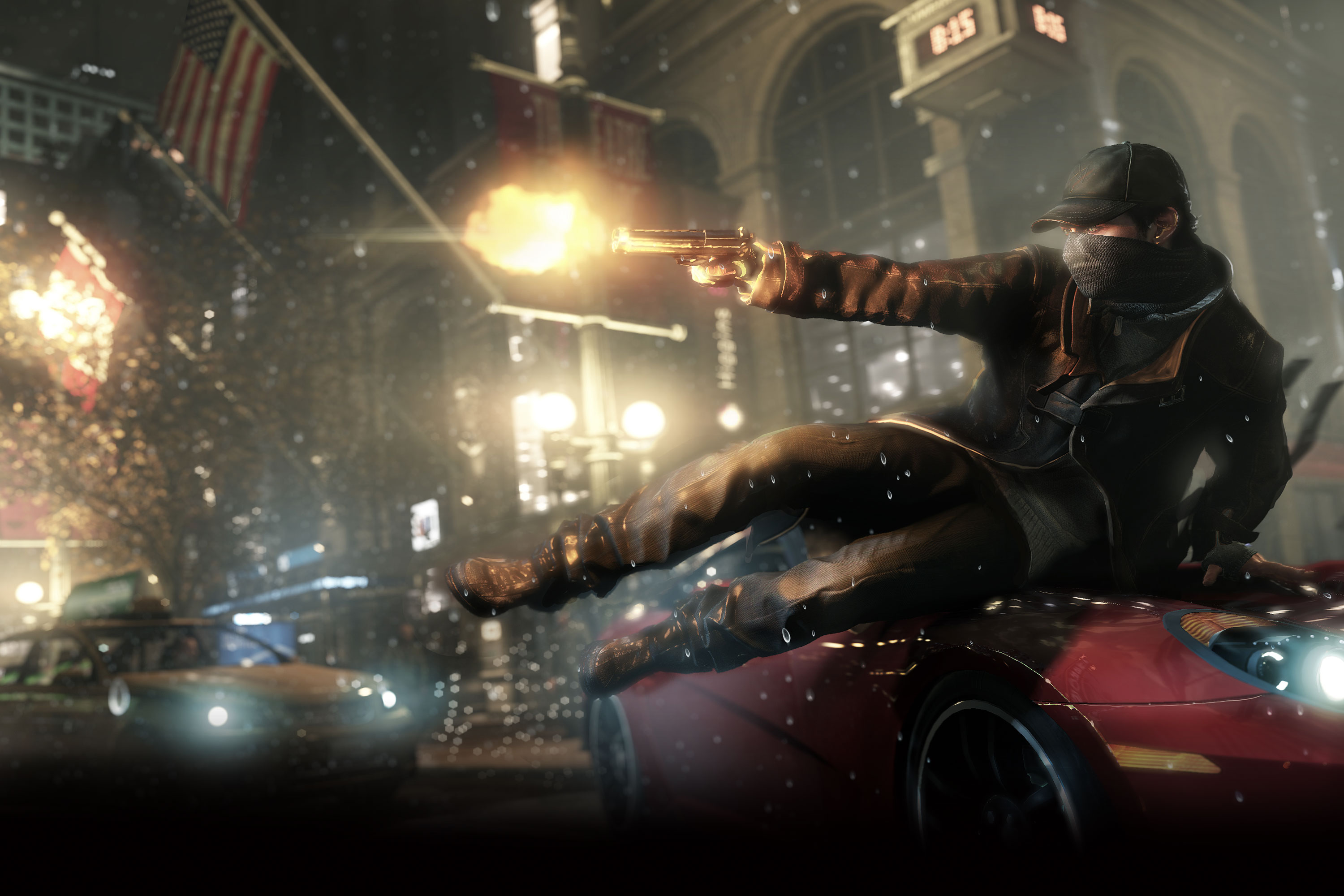
Lines: Diagonal and vertical lines, it looks like he is moving in slow motion.
Shape: He would be the organic one in this, the rest would be man-made structures and cars, square buildings and more round metals as the car.
Space: here it’s not clear at all due to the chaotic environment
Values: Darker colors.
Color: Night setting. City lights dims the scene. Even the gunfire is a bit discrete. And there is also a contrast in colors.
Texture: The fabrics and leather, the metals and concrete.
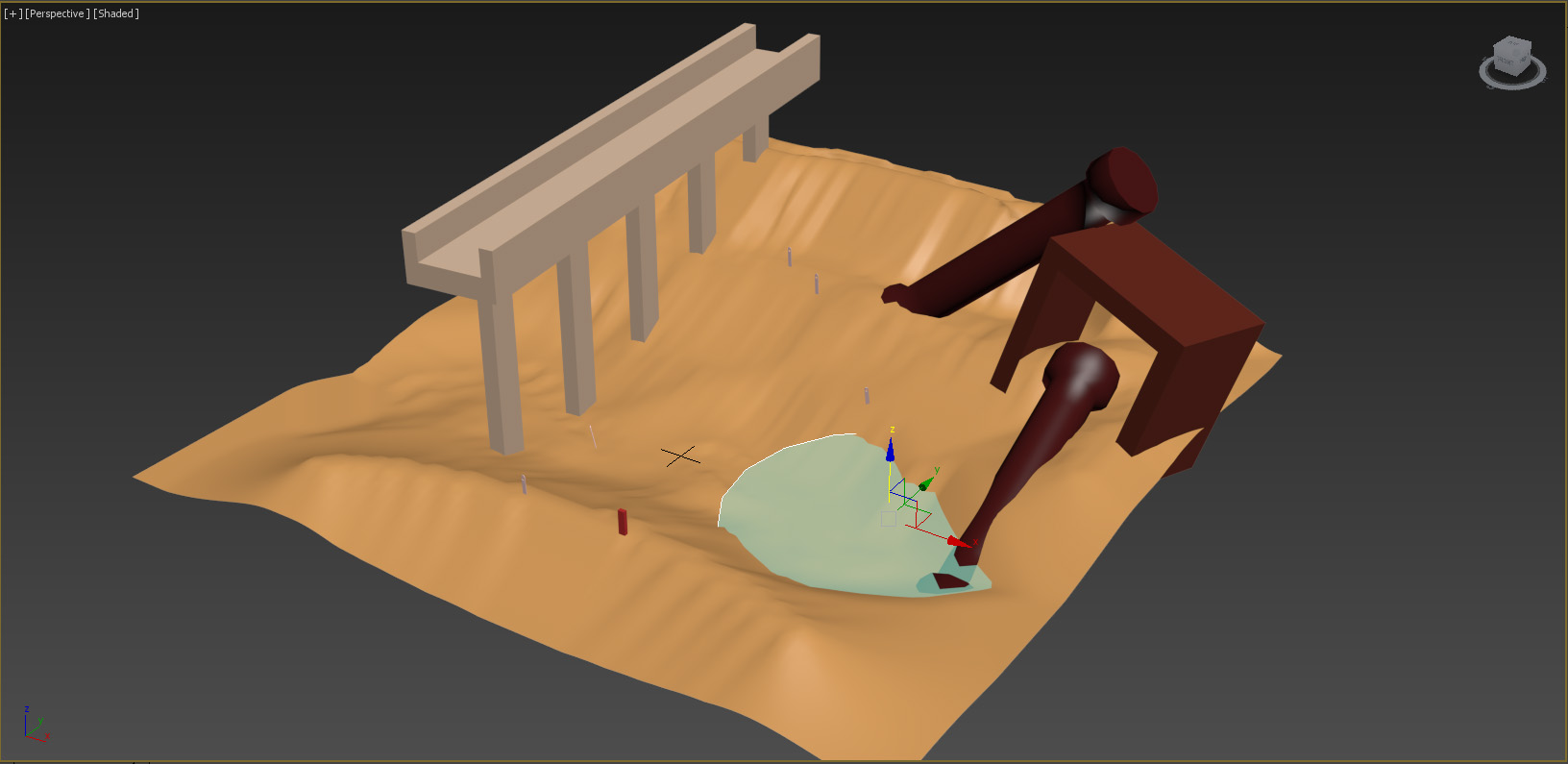
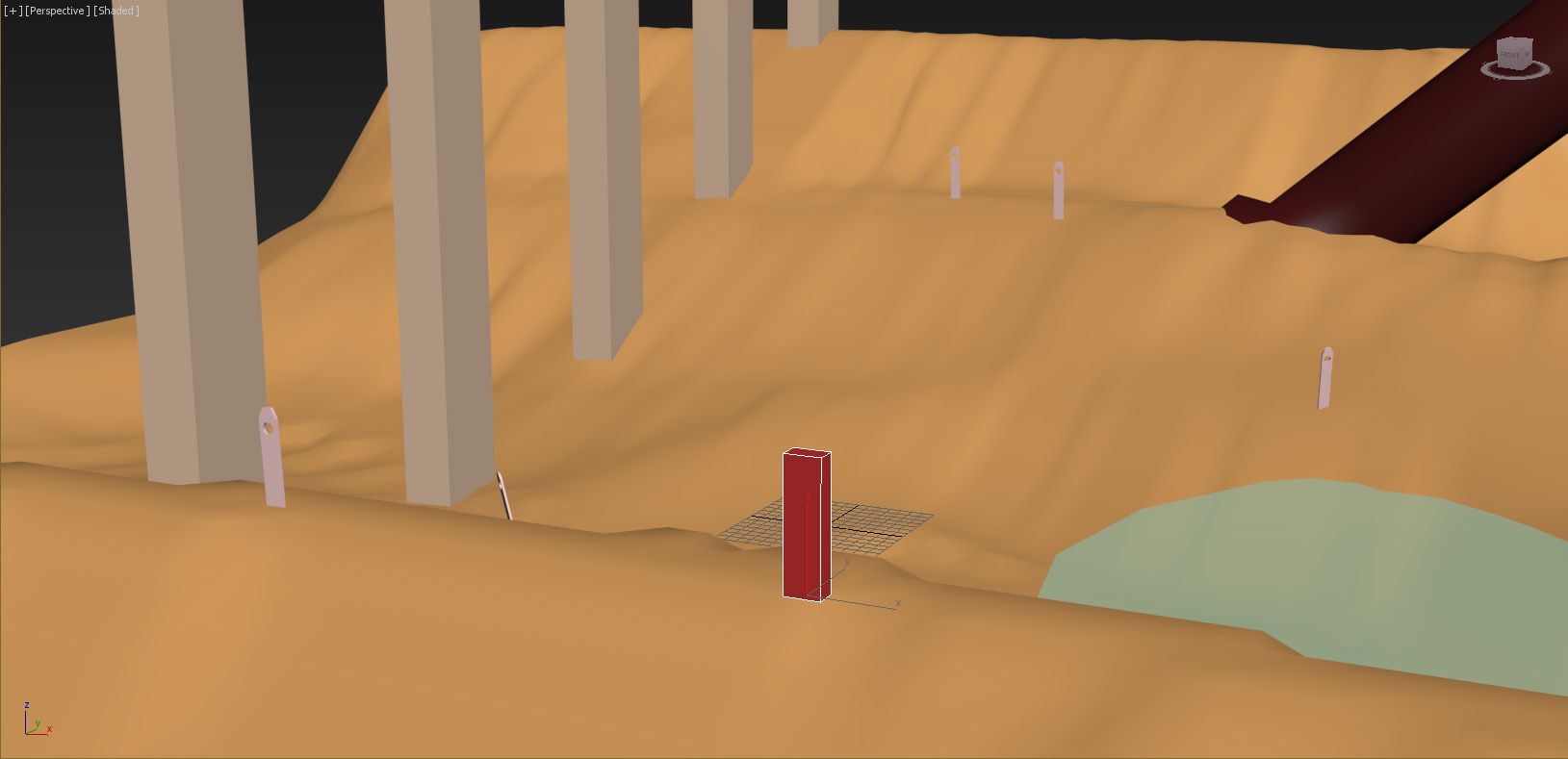
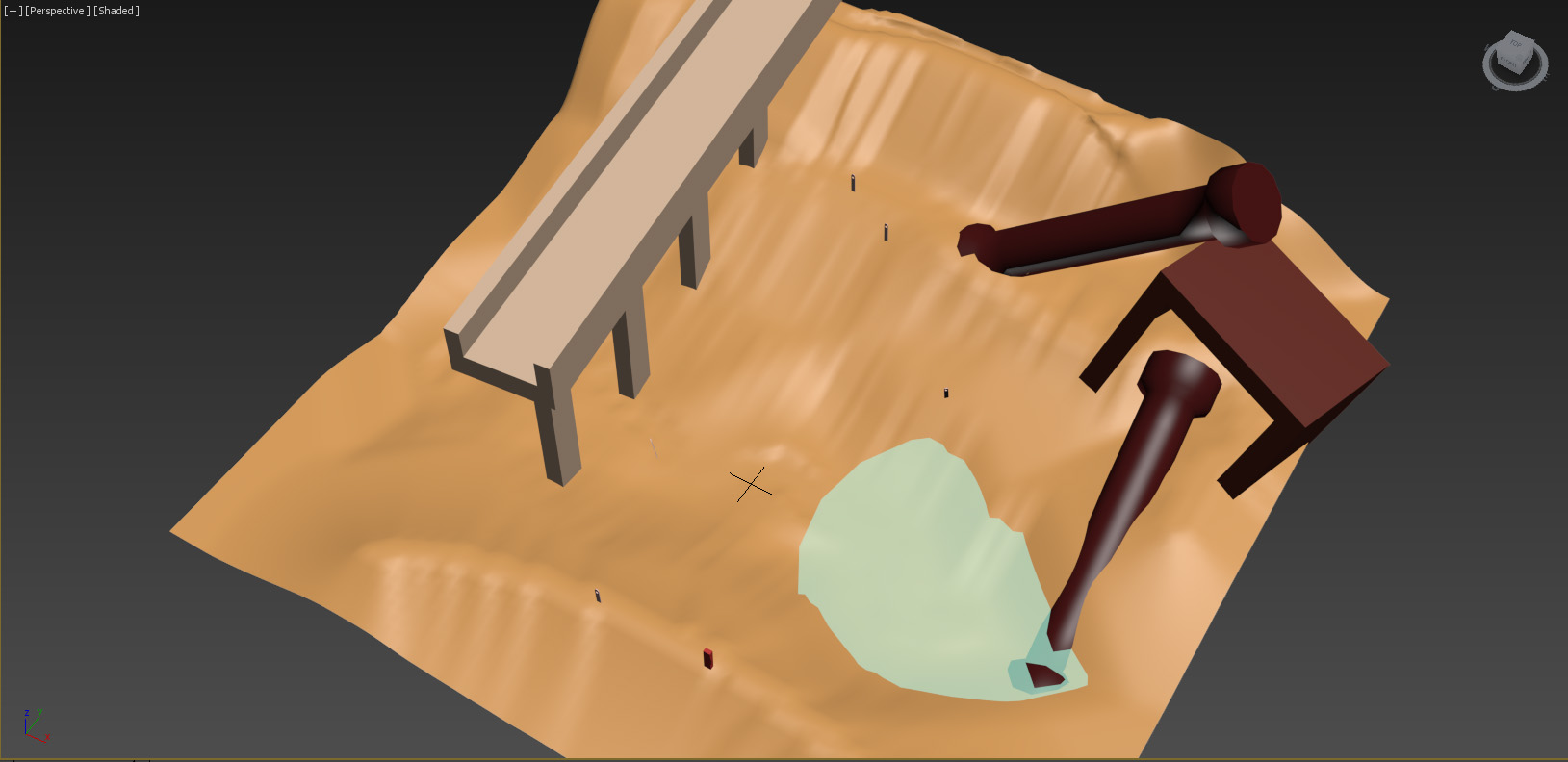
The second assignment, 3D building
We had to choose a game to illustrate by modeling in 3ds max and also to use a keyword. We chose the game “Journey” and the keyword “solitude”. To illustrate the stage we put a lot of effort in trying to make a realistic desert and choosing some structures that would resemble the game, we also wanted to try out some basic texturing by creating some water. We learned a lot together as we explored different areas regarding the 3d software. We imported all the objects made into one picture, placed out all the objects in the picture to portray our message.
Other students thought we achieved our keyword, this due to the player standing alone and observing the abandoned location, the tombstones used was strengthening the message. The color combination was chosen in a way that would resemble the game, to bring the relaxing atmosphere we intended to have, we also tried out the color of the water and saw that it gave the level a bit more life, and it didn’t feel too empty.
As I observed my colleagues I could quickly see the difference in levels between them, one of them combined “uncharted” and “journey” and used the keyword “fear”, it made it pretty hard to read, but it was also a hard decision he made. But I realized that modeling can get you really far if you just use your imagination, to model spikes is really easy now that I think about it. Looking at others opened my mind a lot and I am getting some new perspectives.